

Update: 29.11.2023
In the digital age, where social media platforms dominate our online interactions, TikTok has emerged as a global sensation, captivating millions with its short-form videos. The app’s logo, a simple yet distinctive black musical note on a white background, is a visual representation of the platform’s essence. In this blog post, we will delve into the symbolism and design choices behind the TikTok logo, exploring the brand’s identity and the cultural impact it has made.
Contents
- 1 The Birth of TikTok:
- 2 The Logo’s Aesthetic:
- 3 Symbolism of the Musical Note:
- 4 Dynamic Lines and Movement:
- 5 Cultural Impact:
- 6 Brand Recognition and Versatility:
- 7 Evolution of the TikTok Logo:
- 8 TikTok’s Global Reach:
- 9 Legal and Ethical Considerations:
- 10 Conclusion:
- 11 History of TikTok’s Logo
- 12 Importance of the TikTok’s Logo
- 13 TikTok: The history and Features
- 14 Features of TikTok App
- 15 The Brand identity of TikTok
- 16 Conclusion
The Birth of TikTok:
TikTok, owned by the Chinese tech company ByteDance, was launched in September 2016 under the name Douyin in China. In 2018, the app expanded internationally under the name TikTok. The platform allows users to create and share short videos set to music, fostering a creative and dynamic community.
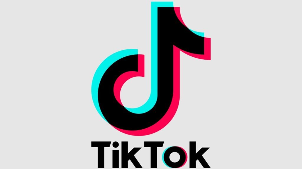
The Logo’s Aesthetic:
The TikTok logo is a clean and minimalistic design, featuring a stylized black musical note on a white circular background. The musical note, resembling a “d,” is accompanied by two smaller lines, creating a sense of movement and rhythm. This simplicity is intentional, as it aligns with the app’s user-friendly and accessible nature. The black-and-white color scheme is not only classic but also ensures versatility across different backgrounds and mediums.
Symbolism of the Musical Note:
The central element of the TikTok logo, the musical note, carries significant symbolism. Music is a universal language that transcends cultural boundaries, and TikTok leverages this by allowing users to express themselves through short videos set to a diverse range of soundtracks. The musical note, therefore, becomes a visual metaphor for the platform’s core identity – a space where users can come together, regardless of their background, to share and enjoy creative expressions.
Dynamic Lines and Movement:
The addition of dynamic lines to the musical note enhances the logo’s visual appeal and imparts a sense of movement. This aligns with TikTok’s dynamic content, where users showcase their creativity through dance, lip-syncing, comedy sketches, and various other engaging formats. The lines also evoke a feeling of energy and vitality, symbolizing the app’s lively and ever-evolving community.
Cultural Impact:
TikTok has redefined the landscape of social media, especially among younger generations. The platform has given rise to viral challenges, dance trends, and internet celebrities, creating a cultural phenomenon that extends beyond the digital realm. The logo, as a visual representation of TikTok, has become an icon associated with this cultural shift, symbolizing a new era of social media where short-form video content takes center stage.
Brand Recognition and Versatility:
A successful logo is not only aesthetically pleasing but also easily recognizable. The TikTok logo achieves this with its distinctive design, making it instantly identifiable even in a cluttered digital space. The black-and-white color scheme adds to its versatility, allowing the logo to seamlessly integrate into various marketing materials, app icons, and promotional content.
Evolution of the TikTok Logo:
While the current TikTok logo is widely recognized, it’s essential to note that logos can undergo changes over time. ByteDance has the flexibility to adapt the logo to align with the platform’s evolving identity or to incorporate design trends. Any future changes to the logo will likely be carefully crafted to maintain brand continuity while reflecting the app’s growth and development.
TikTok’s Global Reach:
The TikTok logo’s impact is not confined to a specific region; it transcends borders, resonating with users worldwide. The app’s global success highlights the universal appeal of short-form video content and its ability to connect people from diverse cultures. The logo, as a visual ambassador of TikTok, symbolizes this global unity through the shared language of music and creativity.
Legal and Ethical Considerations:
As TikTok continues to grow, so does the need for legal and ethical considerations surrounding its logo. Intellectual property laws protect logos from unauthorized use, ensuring that the brand’s identity remains intact. Ethical considerations also come into play, especially concerning user-generated content. The logo serves as a symbol of the platform’s values, and ByteDance must navigate the ethical implications of content posted on its platform.
Conclusion:
In conclusion, the TikTok logo is a powerful symbol that encapsulates the essence of the platform. Its minimalist design, featuring a black musical note on a white background with dynamic lines, reflects the app’s user-friendly and dynamic nature. The logo’s cultural impact is evident in its association with the global rise of short-form video content and the creation of a vibrant online community. As TikTok continues to shape the digital landscape, its logo stands as a visual testament to the platform’s ability to unite people through creativity and shared experiences.
Older Update: 06.03.202021
I can certainly call this era, the era of social media and virtual networking. With continued development in the field of mobile applications, many news apps are promptly becoming popular. One such name is TikTok. There will be barely anyone who would not be familiar with this app. It is a Chinese video-sharing app that is rapidly dominating the virtual media market. Most people around the world have either downloaded this app or are at least familiar with its branding and logo.
TikTok was launched in the mobile app market in September 2016. In no time, the app grew over the social media arena and became a worldwide hit. Moreover, its popularity expanded to the extent that it started competing with the big names of the social media industry including Facebook, WhatsApp, Twitter, and Snapchat. Regardless of the time factor owing to its late launch, TikTok manifested its power by attracting a huge volume of followers. This level of success and that too in a very short time was not anticipated as many previous similar mobile apps failed to make their mark against the giants of this arena. As a result, they were completely scrapped off from the market. On contrary to the established fact, TikTok has a net value of more than 100 billion US dollars with a monthly audience surpassing 1.5 billion.
Knowing its quick and unexpected popularity, many of you might be wondering, what does the TikTok logo actually mean? The branding and logo of any company are usually not accidental creations. Often, the selection of the name, logo, and app color palette involves a thought process. In this article, I will be having a quick look into the history behind the TikTok logo and what it really means.
![]()

Image Source: 1000logos
History of TikTok’s Logo
As seen that these days, many brands find it interesting to gradually change or slightly modify their original logos over time. There are relatively fewer companies that stick to their initial logo design over the years. Having said that, although, I can consider TikTok’s logo as an exception to this prevalent trend. Despite that, the company’s logo has still undergone some small modifications since 2016. However, the main idea and core symbol are the same. The supplementary design elements have undergone slight modifications.
Many of you might be interested to know the name behind this design but it would not be pleasing for you to know that the designer of this logo is anonymous. However, it is known that the initial design inspiration came from a concert which the designer attended prior to attempting the logo design. The idea was to create a logo that emulated the excitement of the audience tuning in to the app. This would signify that this app is a hub of creative content creators and video makers as an attempt to commend their offering.
The “d” letter which is an eye-catching part of the logo is shaped in the form of musical notation. This letter has been included in the logo because the app was initially named Douyin. Although the name of the app was later changed to TikTok, the “d” letter in the logo design has been kept intact.
Importance of the TikTok’s Logo
If I look at the factors which contribute towards any brand or app’s popularity, perhaps nobody would rank the logo as the most important factor. Similar is the case with TikTok. One cannot owe the media ranking and a large audience of the app to its logo design. Nonetheless, logo designs are an important part of the marketing schemes of any mobile app and the same goes for TikTok.
For any company, the development of an attractive and eye-catching logo is important. In mobile apps, the logo is part of the thumbnail which appears on the mobile screen. Therefore, it should be recognizable enough for people to open the app over and over again. The more people use the app, the more revenue it will generate. In addition, the logo is also a vital element of marketing campaigns. Undoubtedly, TikTok’s logo has played a significant part in the app’s digital marketing. One cannot regard TikTok’s logo as the reason for its installation, but it has been a focal tool in creating app advertisements.
In addition, TikTok often capitalizes its recognizable logo while launching licensed, app customized products. There is an eye-catching logo over an array of apparel ranging from t-shirts to trousers to hoodies. Apart from apparel, you can see the logo imprinted on mugs, magazines, and a lot more stuff. The logo licensing has also added to the annual revenue of the app.
TikTok: The history and Features
In 2016, a Chinese tech giant known as ByteDance launched an app for creating short videos by the name of Douyin. In about one years’ time, the service had about 100 million users. Later, the developers introduced it in the market with a new name: TikTok. However, in the United States, a similar app known by the name of Musical.ly was released in 2014. Since its release, it had been gaining popularity. It allowed its users to make lip-sync and dancing videos of 15 seconds duration.
In 2017 ByteDance acquired Musical.ly for $1 Billion and both the platforms were existing simultaneously. Musical.ly in the United States and TikTok in other foreign markets. However, in about a years’ time, the announcement was made that both the platforms will be merged. They will have a joint mission of providing a uniform platform to everybody. Moreover, to establish a community where everyone will have an equal chance to create content. Therefore, all the accounts on Musical.ly were transferred automatically to TikTok.


Features of TikTok App
This service now offered some new functions allowing the users to create different types of content. The features of the App are as following:
- The TikTok app works as a social network platform allowing the users to make 15-second videos.
- The target audience of the TikTok app is generation Z which appreciates arts, entertainment, and authenticity.
- The service also offers a variety of creative tools such as stickers, masks, filters, visual effects, hundreds of tracks to dub videos with. Image Source: Pinterest
- As for the Musical.ly app, the basic content was to lip-sync to videos however, TikTok is offering various ways to express oneself through comedy videos, duets, reactions to popular clips, challenges, and competitions.
- Moreover, TikTok encourages its users to be content creators as well as content consumers, unlike other social media platforms. This service claims to be the most democratic and encourages the audience and users to be as natural as possible and shoot videos from their smartphones.
The Brand identity of TikTok
The identity of the company has not changed a lot in the past years of its existence. The colorful music note icon clearly shows the relation of the app with music. This has been the logo of TikTok since the very beginning. So, let’s get into the detail of what does the TikTok logo means?

Colors
As seen, the TikTok logo is a representation of music notation with three colors i.e., pink, blue, and white against a black background. This logo is no accident but a mere inspiration of the artist who inspired rock concerts with a dark hall and a lit-up stage. The distinct feature of the emblem is that it looks like a 3D image due to the neon colors overlapping one another thus signifying music vibrations. Moreover, apart from this classic version of the logo, there are three more color variants with white, pink, and blue backgrounds.
Fonts
The authors of the TikTok logo have gone for a simple sans serif font. In the beginning, the name had two separate words i.e., Tik and Tok. Later on, the space between the two words was removed. However, both parts of the word were capitalized. Moreover, when the words were put together, it resulted in the font becoming even more rounded, and consequently, the “i” dot was no longer of square type.
![]()

Image source: 1000logos
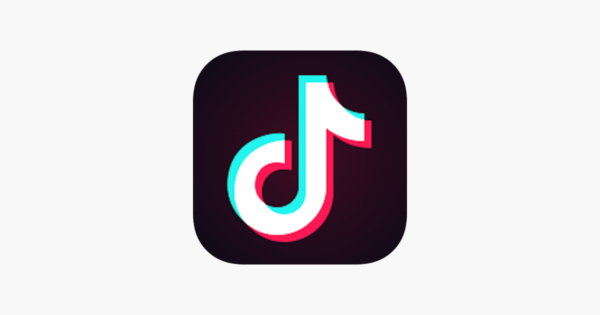
The App Icon
The icon of the TikTok app is similar to that of the favicon i.e., a colorful note on a block square with canted corners. Due to this sharp contrast, the icon stands out and seems to be different from the others on the screen.
Conclusion
For all the brands, the different colors and symbols representing them in form of a logo. The logo actually represents the concepts of the brand along with their identity. The concept of the TikTok logo is merely simplicity and creativity. The minimalism that is evident from the logo shows that it can adapt very easily to different kinds of tasks. This inlcudes a favicon icon and an app icon. I hope you find these details interesting that what does the TikTok logo mean. Next time keep these points in mind when you next use the TikTok app.